
“This year, I’ll be a junior in high school. It feels like this is my last year to improve my techniques before working on an art portfolio for college admission…sometimes it’s too much pressure to think about how I’ll be stacked up against many talented art students who are my age during the college and art school submission process. Everyone is so wonderful and talented!
What are common mistakes in college art portfolio submissions? What shows the difference between a weak art student and a strong art student? I have one year left to prepare – what should I specifically focus on to improve my chances?”‘
A strong art student will command not only technical mastery over their material, but also be innovative and passionate in terms of their subject matter and approach. On the flip side, you can have a weak student who may have good technique, but perhaps is working with subject matter that is obvious and cliche.
A strong student’s work will stand on it’s own, and not look like it’s lifted from some other artist or style. A weaker student might copy something from somewhere else. Strong students are prolific and experimental with their art materials; they are willing to try out unusual methods for handling their art materials.
At the opposite end of the spectrum, a weaker student might use the same art materials all the time, and use them in a predictable, common manner.
There are a number of “classic” mistakes that I see over and over again when evaluating portfolios for college. I can guarantee if that if you avoid these mistakes like the plague, that you will automatically have a major advantage over a significant portion of the other applicants.
Remember, admissions officers have looked at literally thousands of portfolios, and most of these mistakes are nothing new to them. Making any of these mistakes will get you eliminated from the acceptance pile very quickly.
In conjunction to this list below, also be sure to visit this video tutorial on how to prepare a portfolio for college admission. The tutorial goes into great depth about specific actions and approaches you can focus on to improve your chances in the competitive college admissions process.
1) Copying from photographs.
To a trained eye, it’s generally glaringly obvious when something has been copied from a photograph. Drawing from a photograph is a cheap shortcut.
Not only are the results always lousy, but copying from photographs will only develop bad habits that will be difficult to “undo” later. This article I wrote which states many reasons for why it’s critical to draw from direct observation.
2) No anime, manga, fan art, or drawings of celebrities.
Period. Don’t even think about it.
3) Poor quality photographs of the art itself.
Invest the time and money into photographing your artwork properly. Too often I see terrible photographs of good artwork, which makes me nuts. With digital photography, this is affordable and easy to accomplish, it just takes time and labor.
This means properly cropped images, even lighting throughout the image, images that are in focus, etc. In the photograph of this oil painting below, there is a lot of glare on the left hand side of the photo, which makes it very difficult to see what the actual painting really looks like.

4) Blank backgrounds.
Art students will frequently create images focusing so much on their main subject matter that they leave the background blank.
It’s important to balance and distribute your attention to every square inch of the artwork, but very few students do this. Many will intensely labor over tiny details in one area, and then completely neglect other areas of the artwork, leaving them completely untouched.
Backgrounds do not have to be complicated, in fact, you probably want your background to take a back seat to your subject so that it’s not distracting. However, nothing is more distracting than blank white paper that makes your drawing look unfinished.
Be the exception and work on the background as much as you work on everything else in the image. Create backgrounds that are just as lively and engaging as the main subject. If you don’t like the background you’re seeing behind your subject, take the time to create a set up with a background that is interesting to you.
The nature object in this student drawing below is beautifully drawn, but the background is completely blank, making the drawing appear unresolved and empty in the background.

5) Placing your subject dead center on the page.
Composition is almost always ignored by students in their pieces for a college portfolio. This is largely because student don’t even think about where they place their subject on the page. For the vast majority of art students, sticking the subject right in the middle of the page is the default reaction, which makes for a really boring and predictable composition.
This article I wrote talks about specific strategies for creating a dynamic composition that will lead the viewer’s eye throughout the entire artwork. Composition is critical to an artwork, and no amount of spectacular technique will save you from a lousy composition.

Be the exception and take the time to consider where you place your subject. One way to do this is to create thumbnail sketches in advance of creating the final drawing. This article I wrote talks about how to develop a drawing from sketch to finish.
Thumbnail sketches are a very quick way to work out the placement of your subject before you invest time on the final drawing. This video tutorial on drawing a self-portrait from life explains how to create effective thumbnail sketches.
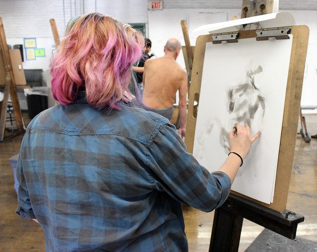
6) Don’t rely on only yourself for feedback.
Many students make the mistake of thinking that they can create their portfolios entirely on their own. Unfortunately, many high school students are forced to teach themselves due to many school art programs being cut back or non-existent.
Take the initiative to seek out advice from an art teacher you trust, preferably one who has experience helping students with portfolios, and who can offer you a candid assessment of your work.
If you don’t know anyone you can ask, we offer 30 minute video critiques on students preparing a college art portfolio for a fee. Get more information on purchasing a portfolio video critiques here, and watch a sample critique below.
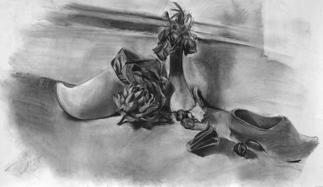
7) Having unfinished pieces.
In my experience, very few students in high school know how to bring an artwork to full resolution. Most artwork I see is nowhere near finished, and requires another 2 or 3 hours to be fully resolved. Other times, its as simple as filling in all the white areas so that no raw paper or canvas is showing.
Push your pieces to full resolution, so that no stone is left untouched. This charcoal drawing below is well done, but the student didn’t bring the charcoal right to the edge of the paper, making the piece look unfinished.
Artprof.org is a free website for learning visual arts which features video tutorials, art critiques, and more.
Related articles
“What is the purpose of a degree in fine art?”
“What should you include in an art portfolio for art school or college?”
“When you have a fine arts degree, what do you do for the rest of your life?”
“How do you preserve your artistic integrity within the strict time limitations in an academic setting?”
“Is art education really so popular in western countries?”
“What do you do after you’ve finished formalized training?”
“Should art students study abroad even if it distracts from job preparation?”
“Who should you make art for, yourself or your professor?

Reblogged this on PortPrep.
All good advice. I would add to also not submit any pictures or photos of cats, dogs, boyfriends, girlfriends, celebrities, or clowns. In other words: avoid all the things you think are cool or are part of a “usual” teenagers life. Yes, it is hard!
If you are applying for a design program and they also have a criteria, follow it with great care and be sure to do what they want. Attention to detail down to how well you glue it, is the board cut clean, etc. are also how it is judged. Messy work and messy craft will not get you into a design program.
Hello! I was just wondering if there are any exceptions to the blank white background rule?
Nope!
Firstly thank you for your detailed article.
I wonder if my artwork inspired by classic paintings, such as “ The Scream” and I paint a mermaid screaming under the ocean because of pollution, using The Scream’s face and similar style (it’s not my style and I do that in purpose ). Is it acceptable or I should not include that piece to my portfolio?
Thank you
Hi! It’s hard for me to give you an accurate answer to your question without seeing the artwork. If you’d like to get an opinion on the piece, you can either submit to receive a free live art critique on YouTube (submission form is here: https://artprof.org/youtube-live-critique-submission-form/) or, you can purchase an art school portfolio critique: http://artprof.org/purchase-a-portfolio-critique